Every fall and spring, the High Point Furniture Market presents all the newest and most colorful home furnishing products to the design community. The colors most prevalent during the fall market are indicators of what you will see in stores for the upcoming year. Here are color directions that jumped out at us at this fall’s market—food for thought when you’re thinking about future updates to your home.
There are thousands of colors that paint companies display and many palettes that Pantone presents to whet our color appetite. A narrower number of colors, however, are sorted out and selected by the home furnishings industry to be shown at the market. It is then up to designers to take these colors and weave them into design projects for our clients.
Let’s begin with GRAY. Happily, gray took over for beige a couple of years ago and has remained king of the neutrals and will continue into the near future to reign over the neutral palette. Gray is often combined with lavender, slate blue and yellow. This refreshing neutral also is the backdrop for crisp white and the always dramatic black.
BLUE in a very wide variety of shades easily translates onto any piece of furniture, accessory or floor covering. This versatile color can cool down a room or make it a warm sanctuary. Indigo is the blue now dominant and expected to continue to be popular over the next year. Blues will move into lighter shades and turquoise, and will be used with dip-dye and hand-printing effects for artisan-craft imperfect looks. If your design scheme calls for lighter shades of blue, don’t be shy about adding a pop of indigo or royal using a lamp or other accessory piece.
Tangerine ORANGE was Pantone’s 2013 color of the year and has proven to have staying power in the home furnishings market. As with any color, too much of a good thing is well, too much. Today, oranges are used as an eye appealing accessory color. You will often see orange combined with gray or dial it back to spice and use with turquoise for a beautiful Southwest design.
Metallic finishes lend a lustrous touch to all manner of accents from furniture to soft goods. GOLD has adorned homes and castles alike but combined with classic silver it creates a collection that embodies refinement and sophistication.
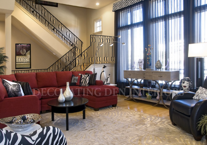
Shades of RED will accent window and bath designs, but be most popular in palettes for the bedroom, living room and kitchen. From vibrant fire engine to deep cherry, shades of red infuse home décor with eye-catching energy. Pair the hue with complimentary orange for a look that exudes unadulterated warmth and zest. Red paired with a black and white zebra print adds drama and makes a statement.
Bright WHITE may not be for everyone, but for those brave enough to use it on furniture, it says, “welcome to the edge.” If you are a little leery about using white or any light color on furniture, there several performance fabrics on the market that your designer can assist you in finding the right one. White accessories such as lamps will liven up any room especially when placed on a painted table. White is dazzling in a room when used with a brilliant backdrop color.
Whatever your favorite colors may be, be sure to incorporate them into your home décor. Your favorite colors can inspire, uplift and soothe the soul. Your designer can help with choosing a palette that includes your favorites and provides just the feeling you hoped for.


