Patricia and Michael live in a delightful three-story home with
their two young sons. The couple has claimed the entire third level
as their own, for both bedroom and bath, but the space has a fairly
large problem:
Patricia and Michael live in a delightful three-story home with their two young sons. The couple has claimed the entire third level as their own, for both bedroom and bath, but the space has a fairly large problem: Having once functioned as a separate attic apartment, the room contains a quirky kitchen and bathroom area that is cramped, awkward and decidedly nonfunctional.
As a result, Patricia and Michael constantly find themselves hightailing it downstairs to share the second-floor bathroom with their kids. And that’s no picnic.
So, tired of viewing the top-floor kitchen/bathroom eyesore each time they emerged from their bedroom, and even more weary of the confusion of a “salle de bains for four,” the couple asked me to create a master bathroom for them that was both super-functional and ultra-relaxing.
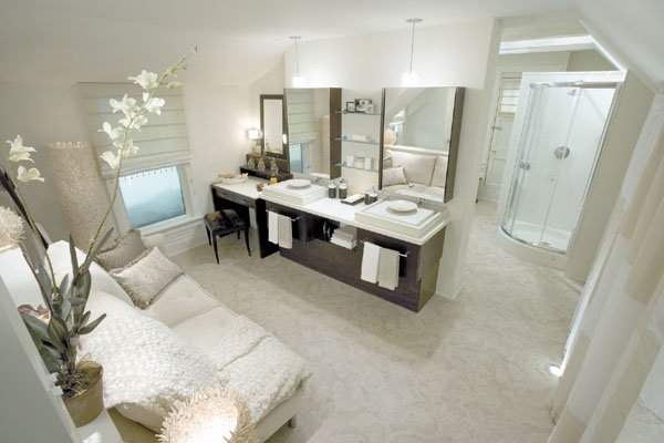
My main challenge here was figuring out how to take the problematic angles, imposing beams and peculiar details of the attic space and make them work for me in creating this calm new refuge. I started by painting all of the walls, beams and other nooks and crannies in a serene coat of cream and by installing neutral-colored flooring. This helped to produce a soothing, monochromatic look throughout the room.
Challenge No. 2 was making the space function on three levels: a practical and tranquil bathroom, a luxurious makeup and vanity area, and a desperately needed storage zone.
I kicked off the job by completely demolishing all of the existing appliances, faucets and fixtures so I could start from square one. I then got to work on the bathroom area, creating two separate sections: a small, hidden alcove for the toilet and a wide-open space for both a stand-up shower and a deluxe oval whirlpool tub with a gorgeous fireplace above.
Next came the makeup and vanity space. I installed a decadent seating area for Patricia, complete with large mirror, illuminating sconces and a mini storage area in a deep, sumptuous wood. For the crowning glory, I wrapped the top of the makeup counter in a lavish, faux-ostrich fabric. I also put in a beautiful new chaise lounge to add a little extra spa-like feeling of comfort.
I then installed a long, solid surface countertop, with two floating stone basins resting on dark wooden cabinetry. To advance the sense of drama, I set up two fantastic mirrors above the sinks that have slide-out storage compartments and integrated faucets that deliver streams of water onto the slabs below.
The storage zone was next on my list. The couple was lacking closet space, so I installed storage along one whole wall of the room and then hid it behind cool wall-to-wall, tone-on-tone checkerboard sheers.
Finally, I attended to the lighting to help brighten this big space. Because the ceilings in the room were angled, it was hard to put up adequate lights. I conquered this dilemma by installing new insulated, recessed lighting and fixtures where space allowed, putting a track light over the tub and then adding some funky lighting on the floor to create a runway from the bathroom area to the couple’s bedroom.
This outdated “apartment area” now had a new lease on life. Using contemporary finishes and fixtures, luxurious fabrics and accessories, and chic lighting and accents, I turned the tricky space into one big, well-appointed bathroom that Patricia and Michael can keep all to themselves. It’s so spa-like they might never want to come downstairs again.


