When Debbie and Nicholas purchased their new home, one of the
biggest selling features was the large backyard, complete with
tennis court and pool. But when it came to the basement, the couple
wasn’t so crazy about the original 1970s decor.
When Debbie and Nicholas purchased their new home, one of the biggest selling features was the large backyard, complete with tennis court and pool. But when it came to the basement, the couple wasn’t so crazy about the original 1970s decor.
With orange carpeting, wood paneling and lime striped wallpaper, this dated, dim space was definitely 30 years behind the times. The news wasn’t all bad, though: The basement definitely had good bones, with lots of space and a functional layout.
Nicholas, a tennis pro, wanted a room where he could entertain students after a heavy workout on the court. Debbie wanted the other end of the basement transformed into a welcoming family area where the kids could watch television, play games or stretch out in front of the fire.
There wasn’t much to save in this space, so we started by stripping off the old wallpaper and ripping up that orange carpet. If I could have chosen only one thing to get rid of in this space, it would have been that carpet. Fortunately Nicholas gave me carte blanche to give the basement a total facelift, so our creativity knew no bounds.
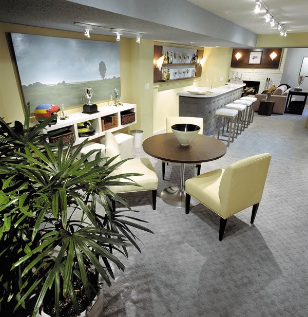
Since the tennis court and pool play such a big part in this household, I chose a color palette reminiscent of sandy beaches, blue water and crisp tennis whites. Chrome accents were also incorporated to give the space a contemporary feeling.
The walls were painted in a fresh shade of ocean blue with sandy golden accent walls. The brickwork around the fireplace and the existing cabinetry in the family area were treated to a fresh coat of white paint. We also enlarged the cabinetry to make it deeper so it would accommodate the television. Presto: The cabinetry got a facelift and became an entertainment center with lots of storage for games, videos and books.
Contemporary blue-gray broadloom was laid throughout the space, and the bar was reupholstered in an eye-catching blue ultra-suede fabric. I designed a modern wood panel detail that we mounted on the wall behind the bar as well as over the fireplace. This common element links both the “tennis zone” and the “family zone.”
The clunky old light fixtures definitely had to go. We replaced them with a full 24 feet of new halogen track lighting. This way, individual fixtures can be directed at furniture, artwork or other key focal points. I also chose some decorative new sconces to fit into the new wood detailing over the bar and fireplace.
With the heavy work done, it was time for the finishing touches. I created a conversational grouping around the fireplace in the family area, using a white sofa, a contemporary new coffee table and two gold slipper chairs. The slipper chairs are perfect for this space because the backs of the chairs are low so they don’t obstruct the view of the television.
Across from the bar, we installed built-in storage tables and bench seating. We topped the benches with comfy, 4-inch foam cushions, complete with back cushions and throw pillows in our palette of sand, blue and white. Since Nicholas’ tennis zone is such a long space, a wooden screen and some greenery serve to shorten the room a bit while allowing a bit of privacy for bathers coming in from the pool.
With fresh new finishes, bright modern lighting and luxurious fabrics, this space was transformed into entertainment central.


